6 essential charts for raising a healthtech round


Raising a healthtech round is never easy—but especially right now. That’s why you need every edge you can get, and one of the strongest signals you can send to investors is that you know your finances back to front. Today, we share six charts that can help you prove it.
We’ve anonymized the data in these charts, but they represent real scenarios. You too can create charts like this in a spreadsheet provided you have clean books or what we call a “data foundation.”
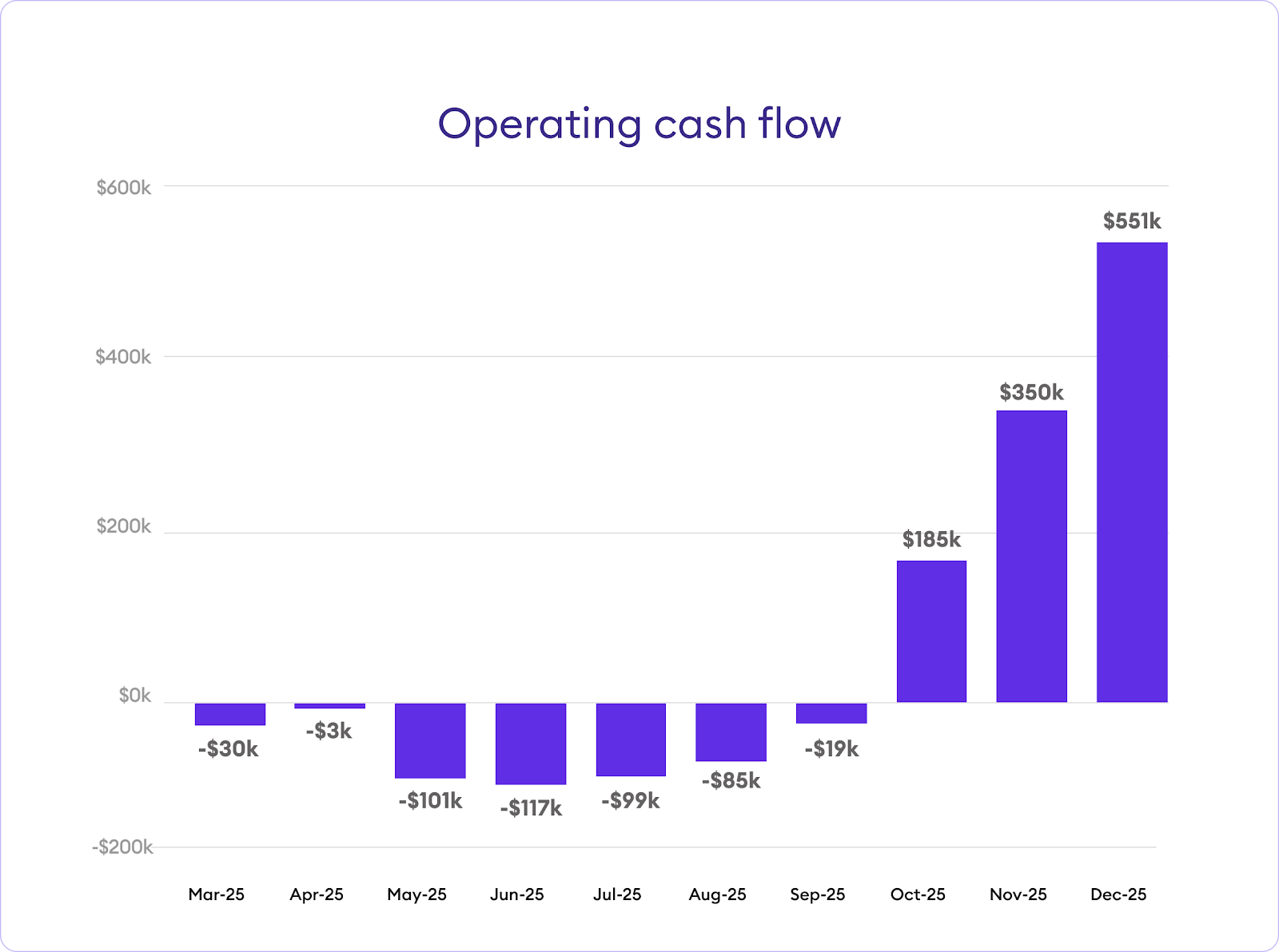
1. Operating cash flow
This shows investors your profitability over time in one simple visual. Essentially, it shows the net change in your cash position per month.
You’ll notice an inflection point from negative to positive—this shows, based on our projections, when you anticipate reaching profitability. This is based on assumptions about your expected costs, when you’ll launch, how you’ll price your product, how quickly you’ll acquire customers, and more.
We find that this chart is particularly useful for pre-revenue companies or those with heavy upfront research and development and clinical trials ahead of them. It shows investors what’s to come.
2. Ending cash balance
Ending cash balance shows your cash balance at the end of each month. It pairs well with the cash flow chart (the one above) because it shows how pre-revenue or research-heavy companies will consume cash before reaching an inflection point when things turn around. (It’s sort of the inverse of cash flow, and shows how much cash you’re actually working with.)

3. Margin over time (3-5 years)
Gross margin shows a projection of how the company will become a revenue-efficient cash machine, so to speak. We find this chart particularly useful for medtech clients with substantial capital expenditures or inventory—it shows how all that capital investment will turn into money, and a machine for making more.
“Margin” is of course the percentage of money you keep. Investors are eager to know that not only will the business generate money, but it’ll keep money, and this showcases that potential.

4. Revenue Mix
The revenue mix chart shows how much cash you expect each product to produce. It’s especially useful for companies with multiple products which sell into different verticals. You can play around with the numbers to show how big macroeconomic changes, like new regulation, might affect things.
This also pairs nicely with chart #3, margin over time, especially when there’s one standout performer as pictured.

5. The profit inflection point
The gross profit inflection point chart shows how decisions you may soon make will impact your profitability. For example, say you want to show investors that your low profit now is because you’re investing in the product and growth, and once you switch to pursuing profitability, the numbers will change markedly, as pictured.

Here’s an example: We worked with a client that needed to pivot their focus from growing towards being profitable. We created a chart like the one above to demonstrate how things would turn around, as well as show the inflection point at which margins would get good.
6. Budget versus actuals
The budget versus actuals chart shows the budget you’ve forecasted, and then month by month, how you actually did. This shows your ability to hold to a plan. If it all works out, it shows you know what you’re doing. If it deviates, that’s an invitation to tell a story about what you’ve learned and how you’ve adjusted going forward.

Once you’re generating revenue, you create a similar chart showing your gross profit. Again, it shows your ability to stick to a plan.

Want help building your case?
There is of course a lot more to winning investor confidence than neat charts. There’s being able to tell a story around this data to guide your decisions, and retelling that story in a way investors will understand. Read about telling a better healthtech value story right now, which we can sum up simply: Know the market, know your impact, know your model, build your record, and be thinking now about exit opportunities.
Reach out to us with questions—we’re always happy to talk to founders. If you want to keep reading, take a look at how much other life sciences founders are paying themselves right now.
Miss!